Last Updated on April 10, 2025 by Kravelv Spiegel
Ever feel like your small room is closing in on you? Like no matter how much you clean or rearrange, it still feels cramped? What if the solution isn’t buying more storage or knocking down walls—but just picking the right colors? Color isn’t just a design detail—it’s a game-changer that can trick your eyes into seeing more space than there really is.
💡Key takeaways:
- Using light colors and cool tones can instantly make small spaces appear larger and more open.
- Strategic use of contrast and accent walls can add depth and interest without overwhelming the room.
- Choosing monochromatic palettes helps maintain visual flow and avoids cluttering the eyes.
- Reflective surfaces and natural light enhance the effects of color tricks by bouncing light and brightening the space.
Why Color Matters in Small Spaces
Ever walk into a room and instantly feel claustrophobic? It’s not always the size—it’s often the color. Color plays mind tricks on your brain. The right shades can make your room feel like it doubled in size. And the wrong ones? Hello, shoebox.
The Power of Light Colors
Let’s start with the basics: light colors open up spaces. They bounce light around and make walls seem to fall away.
White Magic
White is a classic for a reason. It reflects light like a mirror and gives your walls that “infinite space” feel. Want even more magic? Use different whites—warm, cool, creamy—on walls, trim, and ceiling to layer depth.
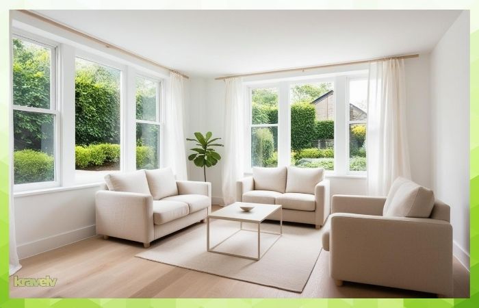
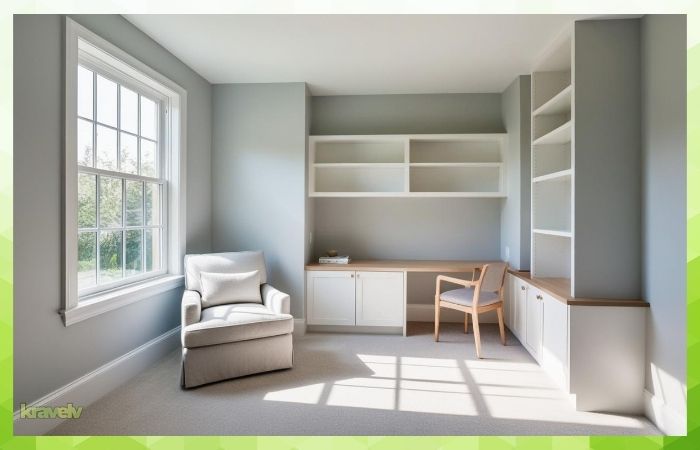
Soft Neutrals Like Beige and Taupe
Neutrals don’t mean boring. Think of them as the background singers that make your furniture and accents pop. Beige, taupe, and even light greys create calm, open vibes.
Pastels – Not Just for Nurseries
Soft blues, mint greens, blush pinks—these pastel tones feel airy and relaxing. They add a touch of color without overwhelming a small room.
Monochromatic Color Schemes
Keeping it in the family (color family, that is) works wonders.
What Is Monochromatic Design?
Monochromatic means using different tones of the same color—like light grey walls with dark grey trim and medium grey furniture.
How It Creates the Illusion of Space
It tricks your brain! When there’s no sharp contrast, your eyes flow easily from one surface to the next, making everything feel cohesive and roomy.
Use of Cool Tones to Recede Walls
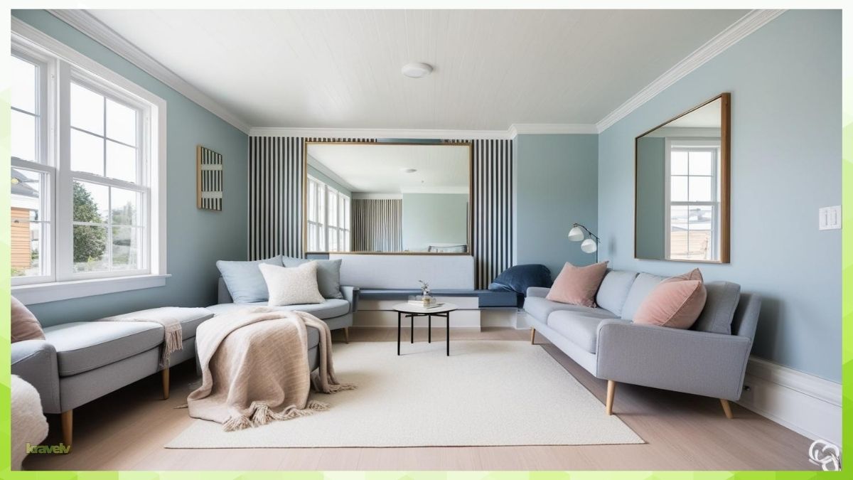
Ever notice how a distant mountain looks bluish or faded the farther it is? That’s exactly how cool tones work in your home—they make walls visually “fall back,” creating a sense of openness. When you’re dealing with a small room, colors like soft blues, gentle greens, and misty grays can make a world of difference. These cool tones reflect more light, feel calming, and trick your eyes into seeing more space than there actually is.
Gray and Blue
Let’s say you paint your living room a light gray-blue. It immediately creates the illusion of depth. Pair that with white trim and furniture in similar tones, and suddenly your tiny room feels like it just took a deep breath. Cool tones don’t just make the room look bigger—they make it feel more breathable.
If you want to double the effect, combine these tones with lots of natural light and mirrors. The result? A brighter, airier, and way more spacious-looking space.
Blues, Greens, and Purples
These colors feel serene and give the illusion of distance. A soft seafoam or dusty lavender can make a space feel like it stretches beyond the walls.
Ocean Vibes for Depth
Want that calming, endless ocean feel? Use aqua or deep blue on one wall (an accent wall) and pair it with light furnishings. It adds depth without shrinking the space.
Contrasts and Accents: The Right Way to Do It
Yes, you can use bold colors. Just use them like seasoning—sparingly and smartly.
Use Accents Wisely
Paint one wall in a darker color or add a bold stripe. It gives character and makes the room interesting, but won’t make it feel crowded.
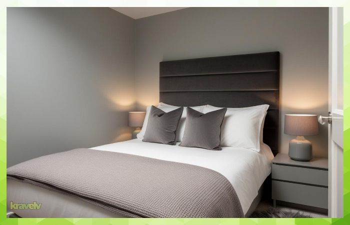
Don’t Overdo Dark Colors
Too much navy or black in a small space? Feels like a cave. Keep them to accents—pillows, rugs, or a single painted wall.
Ceilings and Floors: Don’t Forget Them
When we talk about color tricks, people often obsess over wall colors and completely ignore the ceiling and floor. But here’s the truth: those two surfaces are like secret weapons when it comes to making a small space look bigger.
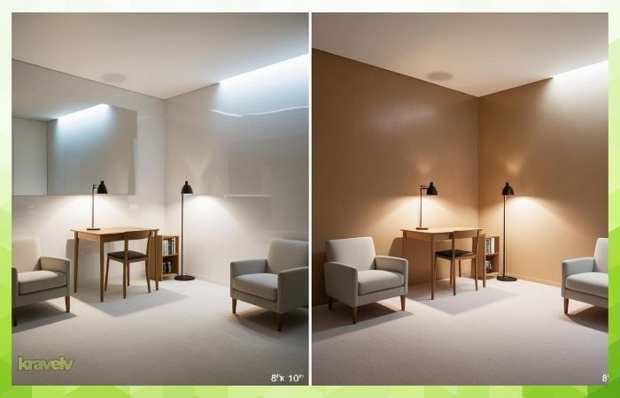
Light Ceilings Raise the Roof
Let’s start with ceilings. Painting your ceiling the same color as the walls—or just a shade lighter—removes the harsh boundary line and draws the eyes upward. This makes the ceiling feel higher, which instantly expands the vertical space in the room. You can even use a soft, sky-like blue or crisp white to give the feeling of an open sky above your head.
Pale Floors Expand Horizontally
Floors matter too! Light-colored flooring—think pale wood, soft beige tile, or light gray vinyl—helps bounce light around and gives a continuous flow that makes the room appear larger. If your floor is dark and you can’t change it, consider using a large light-colored rug to balance it out.
So next time you’re planning a color makeover, don’t leave your fifth and sixth walls—aka your ceiling and floor—out of the equation.
Glossy Finishes vs. Matte Finishes
Paint color gets all the attention, but what about the finish? The level of sheen you choose—whether glossy or matte—can completely change how your small space feels. This isn’t just about style. It’s about how light interacts with surfaces, and how that light can make your room look larger or more cramped.
Reflect Light for Roominess
Let’s start with glossy finishes. These include high-gloss and semi-gloss paints, which reflect a lot of light. This reflectivity helps bounce both natural and artificial light around the room, creating the illusion of brightness and openness. In small rooms, that’s gold. Glossy finishes work especially well on trims, doors, or even accent walls. They can highlight architectural features and make a space feel more polished and alive.
But—there’s a catch. Glossy paints also show every single flaw on your wall. If your walls have dents, bumps, or uneven textures, a shiny finish will put them on full display. That’s why many people limit gloss to smoother surfaces like cabinets or woodwork.
When Matte Makes Sense
On the flip side, matte finishes absorb light rather than reflecting it. This gives walls a soft, cozy, and often more sophisticated look. In a small space, though, matte can sometimes feel a bit flat or heavy—especially if the color is dark or the lighting is poor. That said, matte paint is a pro at hiding imperfections. It’s forgiving, easy to touch up, and ideal for ceilings and less trafficked walls.
So, which should you choose? Here’s a quick cheat sheet:
- Use glossy or semi-gloss on trim, doors, and areas where you want to maximize brightness.
- Use matte where you need to hide imperfections or want a more subtle, elegant look.
- For walls, consider a satin or eggshell finish—they offer a happy medium with a slight sheen, easier to clean than matte, but not too shiny to overwhelm the room.
In the end, the finish isn’t just a style choice—it’s a color trick that, when used smartly, can help your small space look way bigger and brighter than it actually is.
Vertical and Horizontal Stripes with Paint
Stripes aren’t just for fashion—they’re powerful visual tools in home design too. When used strategically, painted stripes can stretch or widen a room with nothing more than optical illusion.
Stretch a Room With Lines
Want your room to look taller? Vertical stripes are your best friend. By drawing the eye upward, they make ceilings appear higher and the entire room feel more grand. Use two tones of the same color (like soft cream and light beige) for a subtle effect or go bold with contrasting hues if you’re feeling adventurous.
Optical Illusions That Work
Now, if you’re trying to widen a narrow space—like a tight hallway or a skinny guest room—horizontal stripes work wonders. They visually pull the walls apart and create that open, spread-out feeling. But a quick warning: keep the stripes relatively wide and the colors light to avoid the space feeling busy or overwhelming.
Striped walls might sound like a bold move, but when done right, they’re one of the best color tricks that make your small space look bigger without moving a single piece of furniture.
The Two-Tone Wall Hack
Paint the lower half of your wall in a darker shade and the upper half in a lighter tone. It grounds the room and lifts the ceiling at the same time. Add a chair rail for extra flair.
Door and Trim Color Techniques
These tiny elements can quietly change the whole vibe.
Blend or Contrast?
Matching trim to wall color makes the boundaries disappear, creating more openness. Contrasting trim adds definition and works best in larger small spaces (yep, that’s a thing).
Tricks to Trick the Eye
Paint doors the same shade as the wall to “erase” them or use a glossy version of your wall color on the trim for subtle pop.
Window Treatments and Wall Color Coordination
Stick to similar tones for curtains and walls. This seamless transition helps the window fade into the background and gives the illusion of uninterrupted space.
Lighting + Color = Double Impact
You can have the perfect color, but if your lighting is off, it won’t work.
Use warm LEDs to soften cool walls, or natural light to brighten pastel shades. Mirrors can also bounce light and color across the room.
Color Psychology: Feel Bigger, Think Bigger
Color influences how we feel. Soft, cool tones relax us. Warm, light tones energize. If you feel good in the space, it naturally feels bigger and more comfortable.
Common Color Mistakes to Avoid in Small Spaces
It’s easy to get carried away with trendy colors or bold statements, but in a small room, the wrong color choices can shrink the space even more. Here are some of the most common mistakes—and how to avoid them:
- Using Too Many Colors
Mixing lots of different hues in one small space creates visual clutter. Instead, stick to a simple, monochromatic palette or soft color variations to keep things cohesive and calming. - Overusing Dark Shades
Deep colors like charcoal or navy can be stunning—but they absorb light and can make small rooms feel boxed in. If you love darker tones, use them as accents rather than main wall colors. - Ignoring Natural Light
Some colors only look good in the right lighting. A color that’s warm and cozy in a sunlit room might look gloomy in a space with little natural light. Always test swatches at different times of day before committing. - Skipping the Finish
The sheen of your paint matters. High-gloss or satin finishes reflect more light and help brighten the room, while matte finishes can make it feel flat and dull. - Forgetting About Trim and Molding
Painting your trim a crisp white or slightly lighter tone than the walls can frame the space nicely and add subtle contrast that enhances the illusion of space.
Always test paint swatches in different lighting throughout the day!
FAQs
What is the best color to make a small room look bigger?
Light colors like white, light grey, and pale blue are great for opening up small spaces.
Can I use dark colors in a small room?
Yes, but sparingly. Use them for accents or one feature wall.
Should the ceiling be the same color as the walls?
Ideally, paint it a shade lighter to create the illusion of height.
Do glossy paints make a room look bigger?
They reflect light, which can help a room feel larger and brighter.
How many colors should I use in a small room?
Stick to 2–3 coordinating shades to keep the space cohesive and uncluttered.
Final words
Small spaces don’t need to feel cramped. With the right color choices and some clever visual tricks, you can totally transform even the tiniest room into something open, airy, and beautiful. It’s like magic—only it’s paint.